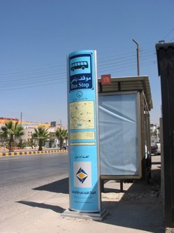
They’ve started popping up in several places. They are light blue and have a slightly curved face and back. They are the latest item of street furniture to (supposedly) adorn Amman’s streets: Bus stop signs.
Most of us who drive have probably noticed the new bus stop signs from our speeding cars, from where they look, dare I say, almost decent. But to be able to judge the functional and aesthetic qualities of these signs, closer examination is necessary.
Before considering the little details though it is worth mentioning that Amman is a city with some strangely chaotic urban traditions. Which can also mean that it actually lacks such traditions. It is a capital city that often behaves like a village. How else can we explain that, in the 21st century, busses in Amman still stop wherever the driver, his passengers or his potential passengers feel like stopping?
Who needs bus stops, not to mention bus stop signs?
Still, the fact that the Transport Authority has come up with the idea of installing new bus stop signs is a good ‘sign’.
Yet on close examination, it becomes clear that this decision, like so many decisions that affect our urban landscape, was probably hasty. What first strikes the eye are the huge ‘corporate sponsorship’ logos on the bottom of these signs. Wait a minute. Is this a bus stop or just another excuse to plant yet another layer of billboards on our streets? This is really taking privatization too far. Bus stops in any city are part of its civic street image. Company logos should have no place on them.
What’s even more annoying is that every sign also carries the name of the sign making company who manufactured them! Maybe these signs are advertising billboard after all that just happen to have a bus icon, map and schedule on them.
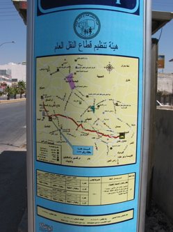
Which takes us to the next point, namely the ‘information design’ of these bus stop signs/billboards. Both sides of the sign carry a map and schedule. Now this is progress. But the presentation of the information falls short on many levels. The quality of printing of the sign (which is actually one big ink-jet printed sticker applied on plastic or metal) is very fuzzy. A map with the buss route is included, with a ‘you are here’ arrow. Below the map a bus arrival schedule is included. All of this information is very useful. But overall, the quality of the design (the fonts used and the presentation style) is amateurish, diminishing the visibility and appeal of the information.
Having the whole sign printed on a big sticker show that an important aspect of transportation signage design was not taken into consideration, namely that of flexibility. Say a bus route number, the schedule or the direction changes. What then? Will the Transportation Authority reprint a huge expensive sticker every time it wants to change a letter on the sign? The correct method would have been to have the schedule, map and route number easily changeable. A good method for that is to always put this information on a simple sheet of paper that can be inserted by Authority employees behind a Plexiglas cover.
The signs are in Arabic only (except for the title ‘Bus Stop’). A tourist friendly strategy for public transportation would have stipulated that at least the basic information on these signs should have been presented in both Arab and English.
Stations on a route are identified on the signs by sequential numbers. This is a missed opportunity to start giving these bus stations real names, derived from the names of streets, plazas or important buildings near the bus stop. It is much better to tell someone “get off at the Mekka Street station” that to say “get off at station 176”.
Finally, a big question that should be asked when producing such signs is about their durability. We all know what happened with public phones in Jordan. Vandalism will also hit these signs. That’s why they should have been made of much sturdier, durable, cleanable and maintainable materials.
In Jordan, we should not be re-inventing the wheel when it comes to the design and manufacture of urban furniture and accessories. There are so many examples in the world that can be copied or improved upon for adoption in our streets. Such matters cannot be left to sign makers alone. It is time we take the image and user friendliness of Amman and our other cities more seriously. It’s not enough for a city that wants to claim its place in the world to have luxurious five star hotels and shopping malls. All aspects of our urban design, from the big picture, to the tiniest sign on the street needs to be considered with care.
Comments
7 responses to “Amman’s new bus stop signs: are they any good?”
When I first saw the new signs from my car I was happy to have such thing in our streets, but now after reading this I feel a bit frustrated.:(
Thanks Ahmad
A month ago or so, I was heading downtown, so I decided to use the big bus, and this was where I had the chance to stand closely to this “sign” and get to inspect it! And to my surprise, main three remarks were the fuzzy printing, the horrible design and no English! Then I said to myself, why can’t we at least imitate other people who have been pioneers in this field! When Turkey wanted to make their first Metro (Subway) in Istanbul, they approached France to use their experience in building the 1st line there! Couldn’t the Visual Criminal just take a peek at what those people did? Didn’t he/she put his/her hands on any good map just to follow the main style!
Of course then I realised the huge logos!
Yet another Visual Crime!
Thanks Ahmad for pointing this out.
Salam
Actually I dont care if it look good or not, what draw my attention is the new movement in jordanian private sector,
they start in somehow helping the public sector, and provide some free service, what I recall now, Fastlink Universities student scholarship, and thos bus signs,
I’m sure at first they will try to use it for their own advertising, but this is very normal, things kinda changing, slowly but its happening,
I think in soon future we will see more offers by jordan private sector to the community and the public sector….
That how i can see it. the good part not the ugly one.
It’s not not about “looking good”. It’s not about looks but function. Also I don’t think that the public sector should wait for the private sector to help in something as simple as bus stop signs. The city has money. Just look at the Abdoun bridge being built. In a few months, when the printing starts to peel off, these bus stop signs will become another (Makraha Si77iah) “A threat to public health” as the rotting public phone booths are now being called by the press.
It’s not about looking at the “ugly” part of change. It’s about demanding that simple things should be done right and that public money, or money given by the private sector to the city is not wasted.
Thanks..
Ahhh .. the classic debate of Form vs. Function.
We need a serious analysis and reorganization of our urban landscape. Amman – as much as it is my favorite city on earth – is still by most standards poorly planned and by some measures ‘ugly’. MOGA (Municipality of Greater Amman) has a ‘Beautification of Amman’ effort, why not organize with the private sector, NGOs, and even Colleges and High Schools, through which they can organize clean-up events (for the ugly purple ALO phones, that shouldn’t have been allowed to look like that in the first place), and to help with urban planning efforts.
These parties can also be used as focus groups to determine the effectiveness of bus stop signs, various municipal services, and to give general ideas. Serious planning would be required, but we can do it.
My 2sense.
Ameen Malhas
I just wanna say,like somone else here said,i dont care if the bus stop signs were made out of cardboard,like here in australia,some of the older bus stop signs are kinda,which are being replaced by electronic ones,are,well,crap.but the info,such as bus number,time the bus arrives etc is clearly shown and all that stuff,so why cant the guys who put the signs do that,like okay you’ve set up bus stops,which lets say cost 500 jd’s each,cant you just slap on a A4 piece of paper with some info that’ll cost you hald a dinar that’ll make life for the jordanian easier?
There is more than one issue that can be discussed here.
I agree with almost every one of you on several points.
First of all, when it comes to a matter of serving the public, function is more important than the image. I agree that it should look appealing, but what’s the point if one can’t read it. The stations’ names would better have names known to people rather than numbers. “Pretty” is good, but the point is to help people, including those who are just visiting and need to read the information in English for them to know where they’re going. Design has to be functional, that is what separates it from art.
Then comes the issue of the private-public sector. I haven’t been living in Jordan for more than five years now and I don’t know what’s going on but it seems clear to me that Amman is becoming a consumer society..when advertising for private companies takes over, it becomes a sad situation.
I know it’s a sign of modernism and improvement in some sort, but there are things that are essential PUBLIC services that exist in every country, no matter where, such as telephone booths which I do not understand why they don’t exist in Amman anymore.
Some services should remain public, with nothing but the government’s name on them. We can’t “logo-lize” everything!